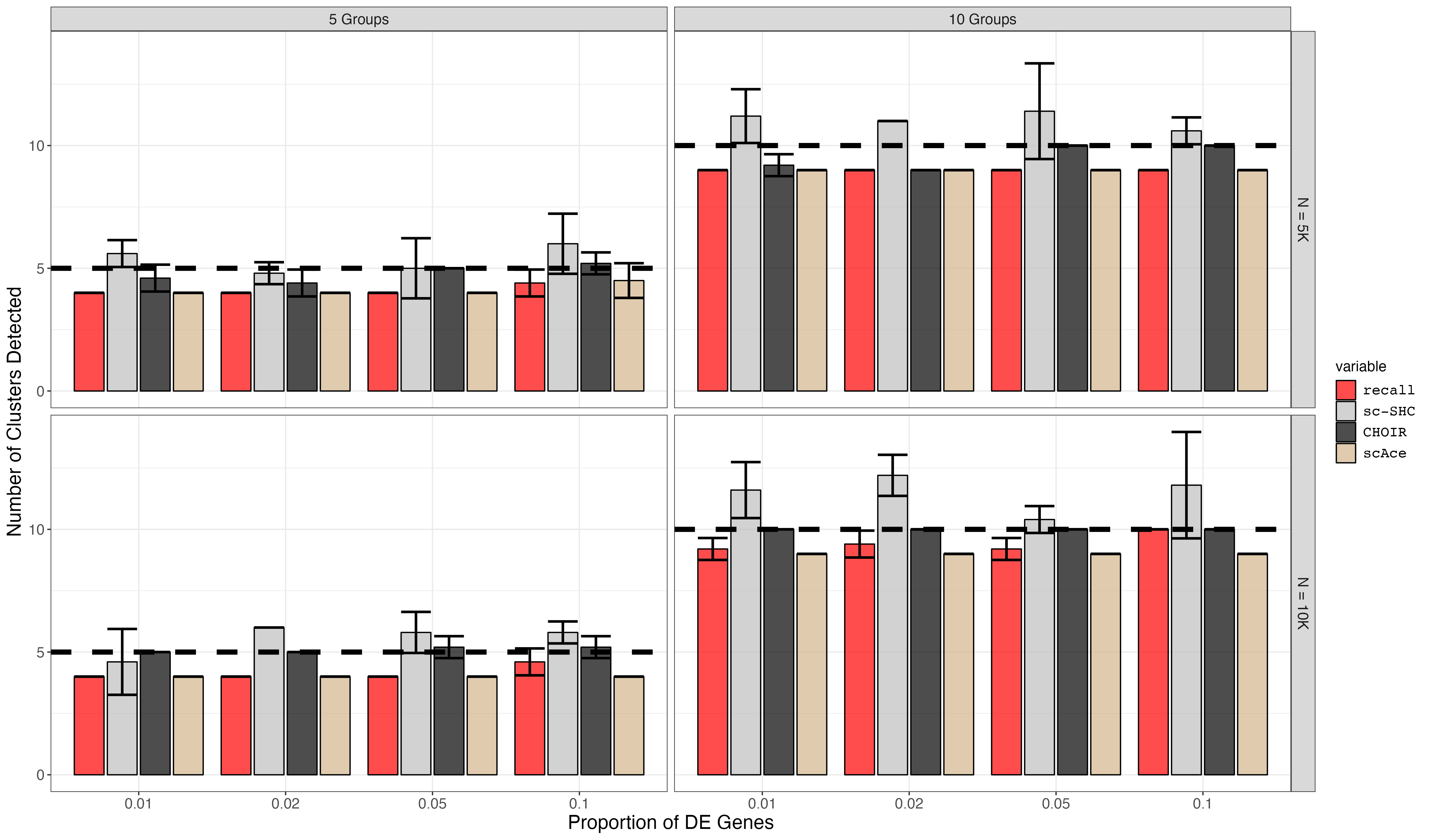
7. Rare Cell Type Marker Gene Titration Simulation Plotting (Supplemental Figure S10)
07_plotting_S10.RmdFirst, we load all of the data from the simulations.
df5 <- read.csv("marker_genes_simulations5.csv", row.names = 1)
df10 <- read.csv("marker_genes_simulations10.csv", row.names = 1)
df <- rbind(df5, df10)

scace_df <- read.csv("scAce_results.csv", row.names = 1)

df <- melt(df, measure.vars = c("recall_num_clusters", "scSHC_num_clusters", "CHOIR_num_clusters" ))
scace_df <- melt(scace_df, measure.vars = c("scAce_num_clusters"))

df <- rbind(df, scace_df)

df <- subset(df, num_cells < 20000)

df$de_probs <- factor(df$de_probs)
Next, we summarize the mean and standard deviation of the number of clusters.
df <- df %>% dplyr::group_by(across(all_of(c("num_groups", "num_cells", "de_probs", "variable")))) %>% dplyr::summarize(
  mean = mean(value),
  sd = stats::sd(value))
We plot the summarized data.
small_text_size <- 12
large_text_size <- 16

linewidth = 2
pt_size = 4

facet_labels <- c(
  `5` = "5 Groups",
  `10` = "10 Groups",
  `20` = "20 Groups",
  `5000` = "N = 5K",
  `10000` = "N = 10K",
  `20000` = "N = 20K"
  )


p <- ggplot(df) +
  geom_bar(aes(x=de_probs, y=mean, fill=variable), stat="identity", position=position_dodge2(), alpha = 0.7, colour = 'black') +
  geom_errorbar(aes(x=de_probs, ymin=mean-sd, ymax=mean+sd), position=position_dodge2(), size=1) +
  facet_grid(rows=vars(num_cells), cols = vars(num_groups), labeller=as_labeller(facet_labels)) +
  geom_hline(aes(yintercept=num_groups), linetype="dashed", size=linewidth) +
  expand_limits(y=0) +
  theme_bw() +
  ggplot2::scale_fill_manual(values = c("red", "grey", "black", "tan"), labels = c('recall','sc-SHC','CHOIR', "scAce")) +
  ggplot2::scale_y_continuous(breaks = breaks_pretty()) +
  #ggplot2::scale_x_continuous(breaks = c(0.01, 0.02, 0.05, 0.1)) +
  #scale_y_continuous(breaks=seq(0,150,30)) +
  ggplot2::xlab("Proportion of DE Genes") +
  ggplot2::ylab("Number of Clusters Detected") +
  ggplot2::labs(color = "Method") +
  #ggplot2::annotate("label", x = 10, y = annotation_pos, label = "Num. True Groups", size = 6) +
  ggplot2::theme(axis.text = ggplot2::element_text(size = small_text_size),
                 axis.title = ggplot2::element_text(size = large_text_size),
                 strip.text = ggplot2::element_text(size = small_text_size),
                 legend.text = ggplot2::element_text(size = small_text_size, family = "Courier"),
                 legend.title = ggplot2::element_text(size = small_text_size))

p


ggsave(filename = "marker_gene_titration.png", p, width = 3.4 * 1440, height = 2 * 1440, units = 'px')